16th of May 2015
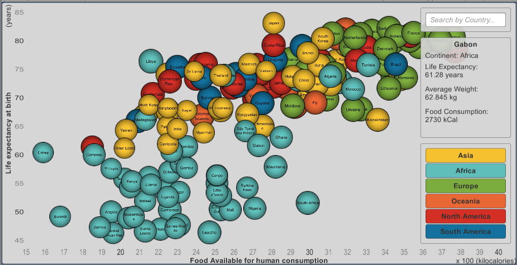
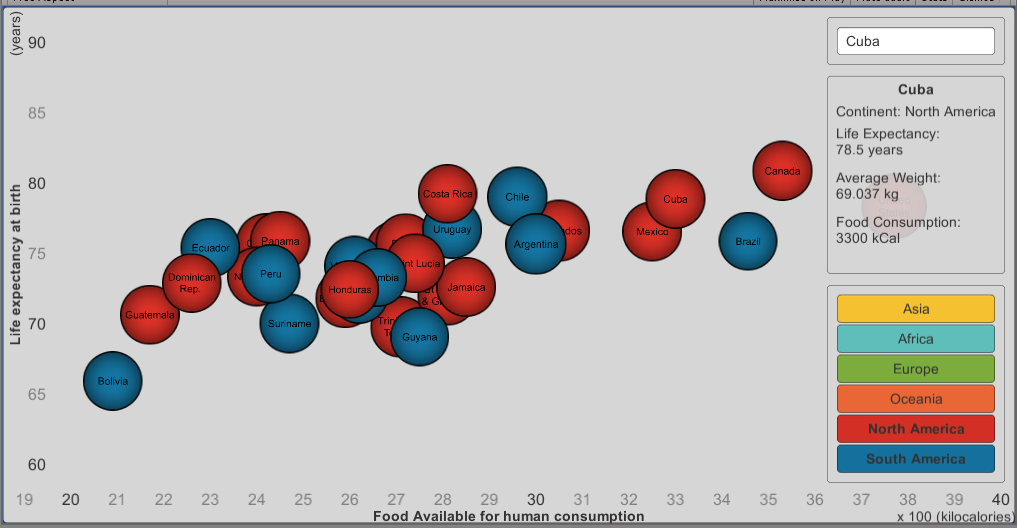
This is interactive data visualisation I made in Unity. The graph type is a bubble chart with on the x-axis the food that is available for consumption in a country, on the y-axis the life expectancy at birth in a country and finally, the size of a bubble represents the average weight in that country.